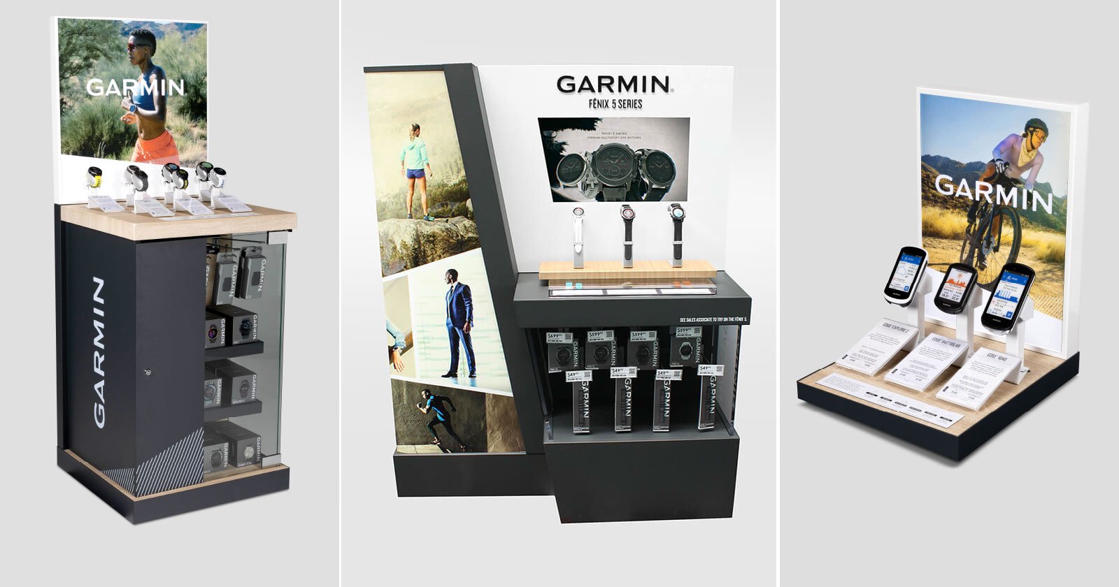
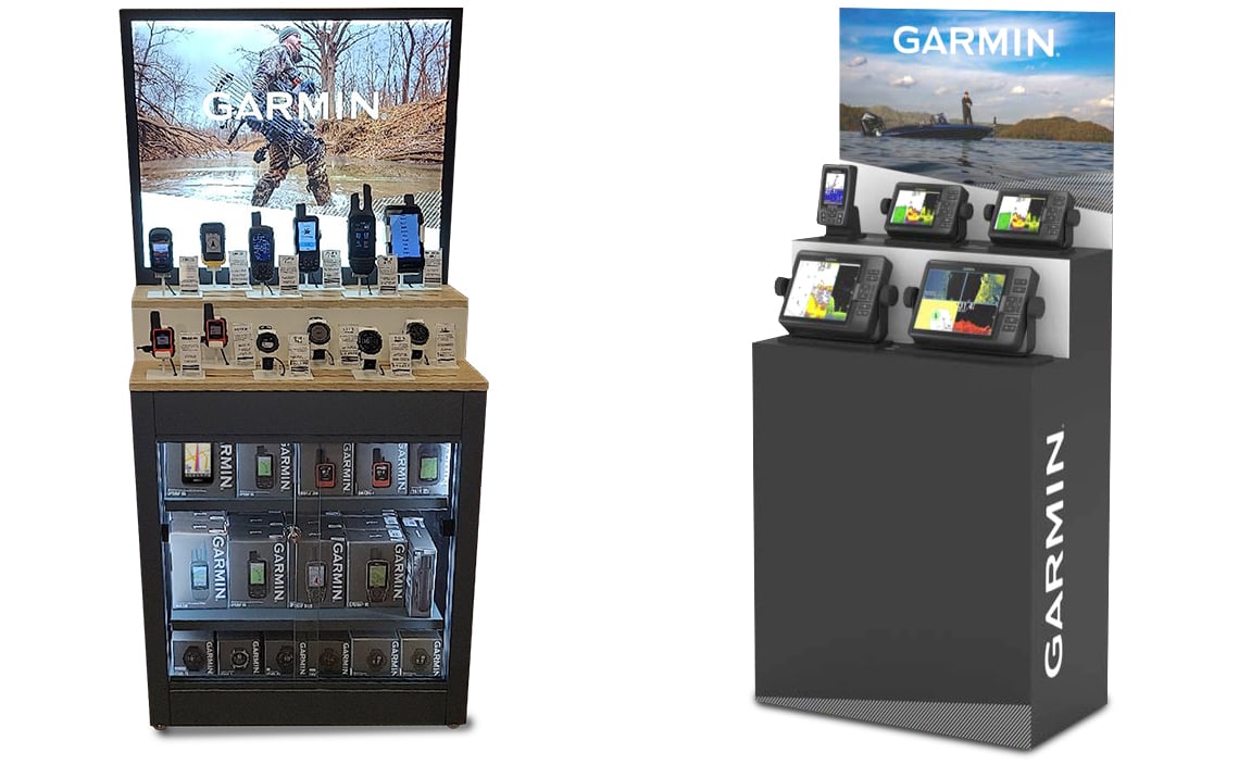
Look to use photography as a single focus when and where we can.
Multiple photo layouts can be created for specific retailer requests.
Original garmin produced photography should be considered first. If the need is beyond current brand assets, then stock photography can be considered. All photography usage should be reviewed by art or creative directors.
Reference the photography section of the style guide for more details.
Primary color applications should always look modern and tasteful. Black and white are the two primary options in order to create absolute contrast with the lifestyle photography. The secondary color palette should be used to add a hint of visual interest. When color photography or video is not available in any execution, use of secondary colors can be considered.
Reference THE COLORS section of the style guide for more details.
Brand colors should be used at the global retail level. Segments or categories within segments should not receive their own color schemes.
Primary
Black
0-0-0-100
000-000-000
#000
White
0-0-0-0
255-255-255
#FFF
Secondary
Candy Blue
PMS 297
50-0-0-0
109-207-246
#6DCFF6
Retailer Defined
Additional colors
can be created for
specific retailers and
should be approved
by an art director or creative director.
Avoid using Candy Blue when a lifestyle photo is the central focus of the composition. Candy Blue should be used sparingly unless it’s created as a background for product photography. Applying a simple vignette around the corners of a blue background can add some depth to the space it creates.
Materials
It is important to be consistent when using materials across all displays. This is crucial when establishing our brand from store to store. Metals paired with acrylics elevate our presence while giving strong contrast that allows each product to stand out.
Additional materials may be sourced based on budgets and availability. Please consult a Garmin creative director for guidance.
Primary
Black Metal

Hartford Grey Text – Fine Texture
HGY-0656
White Acrylic

Opaque White
Thermofoil Wood Texture
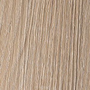
Dorato Oak Natural EI/4301 -.014"
(350my) Emboss: E32 BL
TFL Match: UNIBOARD K34
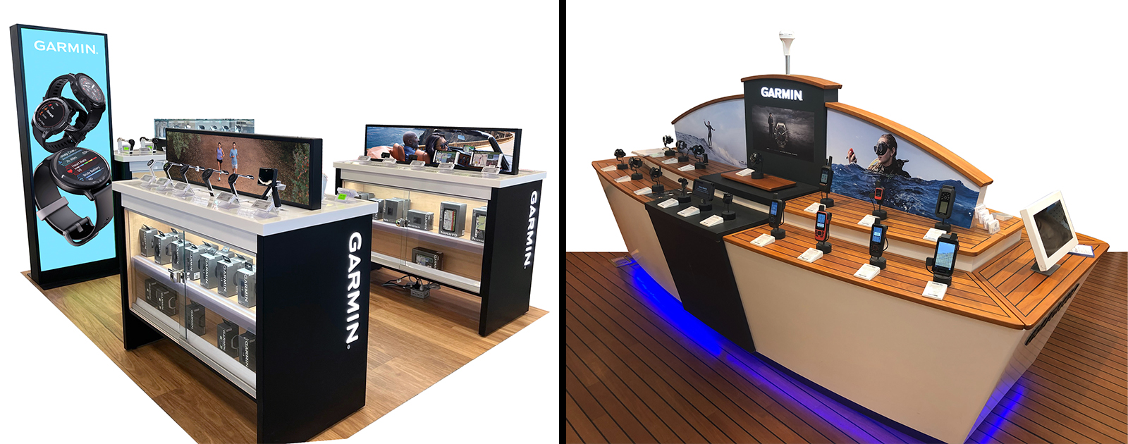
Materials
It is important to be consistent when using materials across all displays. This is crucial when establishing our brand from store to store. Metals paired with acrylics elevate our presence while giving strong contrast that allows each product to stand out.
Additional materials may be sourced based on budgets and availability. Please consult a Garmin creative director for guidance.
Primary
Black Metal
Hartford Grey Text – Fine Texture
HGY-0656
White Acrylic
Opaque White
Thermofoil Wood Texture
Dorato Oak Natural EI/4301 -.014"
(350my) Emboss: E32 BL
TFL Match: UNIBOARD K34
Materials
It is important to be consistent when using semipermanent materials across all displays. This is crucial when establishing our brand from store to store. Corrugate and expanded PVC are two materials being used across many displays. But other materials can be used when completing specific tasks. Always look to use the best materials within the budget.
Additional materials may be sourced based on budgets and availability. Please consult a Garmin creative director for guidance.
Primary
Corrugate
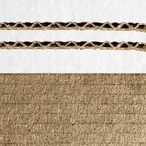
Expanded PVC

It is important to maintain consistent logo use in both permanent and temporary POS displays. The sans delta version should be used in all consumer-facing displays. Both vertical and horizontal formats are permissible. When using the vertical layout, the top of the logo should always rest on the side of the display space.
Reference THE LOGO section of the style guide for more details.
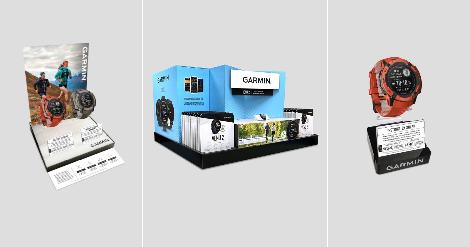
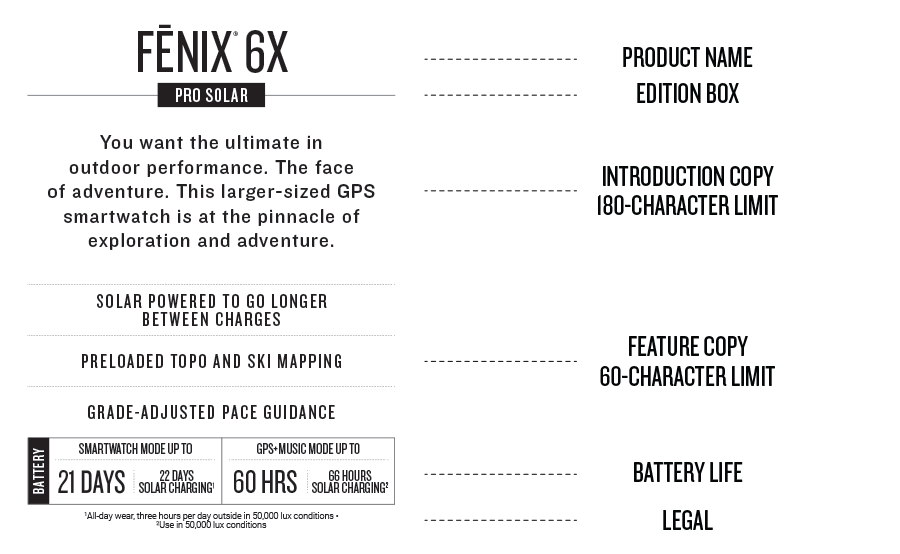
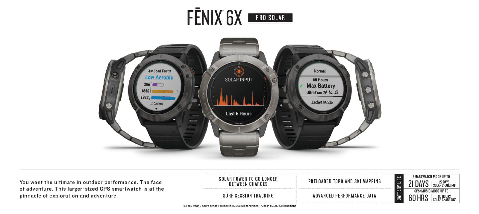
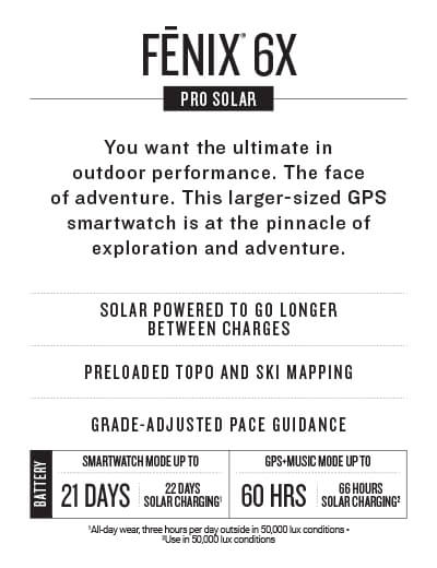
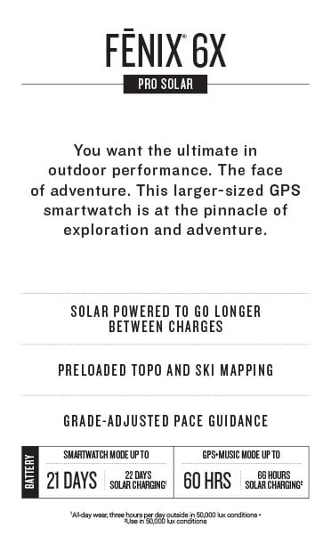
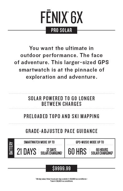
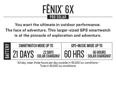
Product Cards
It is important to use product cards in POS materials when possible. These templates, created by the branding and merchandising teams, are used to keep product card creation to a minimum. Varying sizes are available for use. If the display cannot work with current card presets, new versions can be created as long as they match the overall product card look and feel.
U.S. Sizing
Type A
11.75" x 5.232"
Type B
2.875" x 3.76"
Type E
3" x 5"
Miami Store
5.5" x 8.5"
Small Product Card
2.4375" x 2"
Common Features
On displays where space is available, a “common features” area can be added. This is meant to highlight features that can be found across many Garmin devices. Features selected for this section should be within the category or categories of the products shown on the larger display unit.
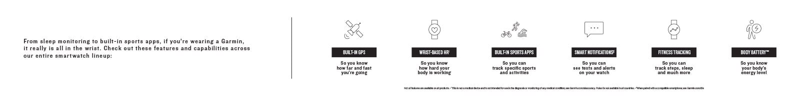
New icon requests should go through the marketing communications department at corporate headquarters.
Reference THE ICONOGRAPHY section of the style guide for more details.